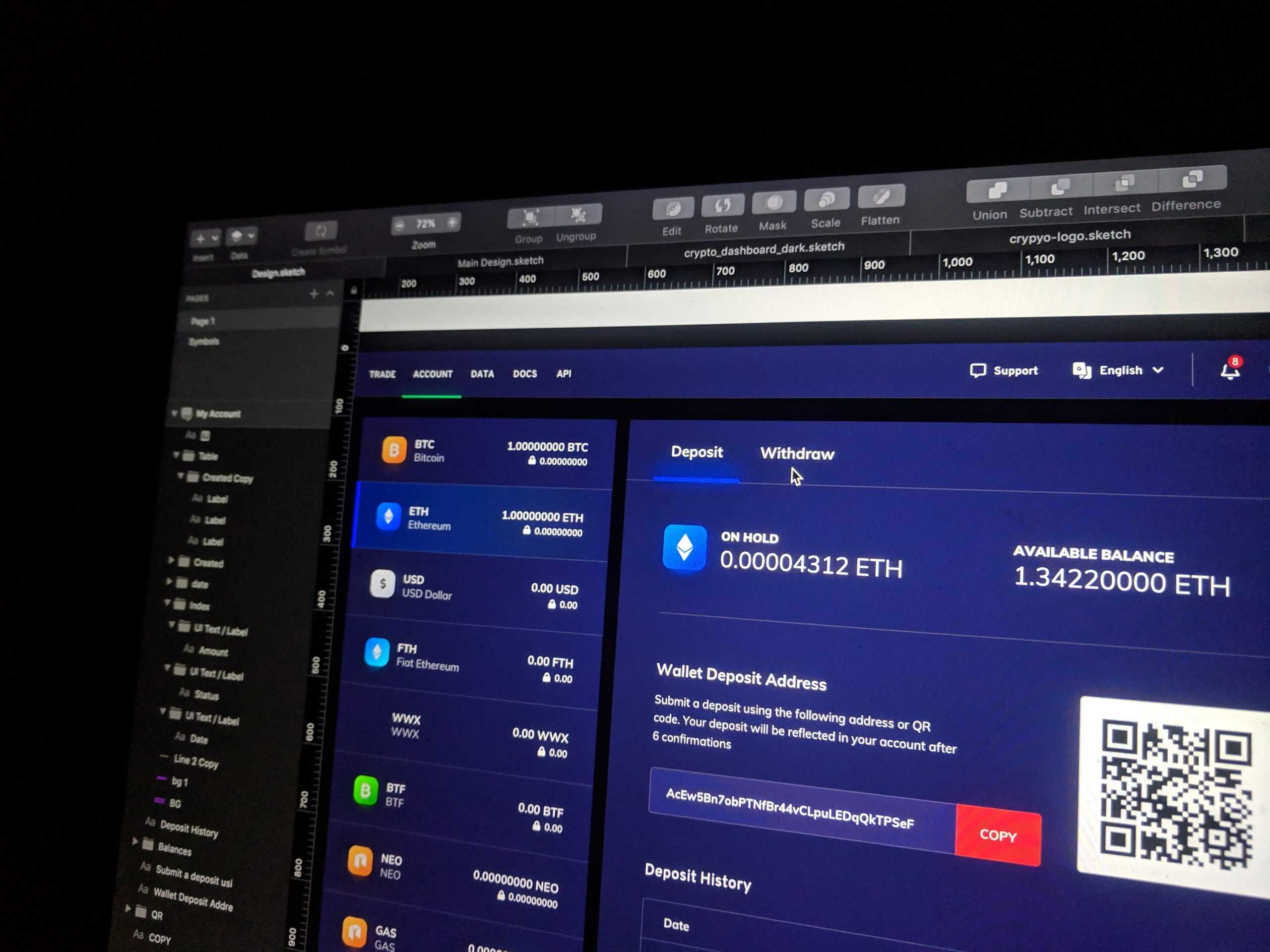
The hype surrounding Dark Mode - a tendency towards designing with a predominantly dark palette, to put simply - has been exponentially rising in recent years. Both tech giants - Apple and Google - have made it an indispensable part of their UIs, many others have followed suit and it has now become one of the most generally sought after UX/UI features.
There are quite a few major factors behind this recent popularity related to dark visuals and aesthetics. Dark UIs support information architecture and visual hierarchy – often implemented when projecting a feeling of elegance and sleekness, or when going for a strong, dramatic look.
That said, the benefits of Dark Mode extend much further than just visuals and aesthetics, for example:
Health Benefits
Dark mode is deliberately designed to reduce the so-called ‘digital eye strain’. With the rapid growth and increased usage of digital technology, we spend a large chunk of our days staring at screens. Thus, digital eye strain is an issue familiar to many of us. It commonly manifests itself as neck pain, headaches, blurred vision or eye strains.
Dark UI significantly minimises these effects - while also eliminating distracting white spaces on websites and apps, in this way enhancing our comprehension and focus at the same time.
Longer battery life
Displays on mobile phones are usually the biggest power consumers – the amount of power directly corresponding to the total amount of light they emit. That said, Dark UI apps can notably prolong the battery life of your smartphone.
For example, as pointed out by Reeno Koemets from Weekdone, when used at 50% brightness, the Dark Mode interface in the YouTube app saves about 15% of battery life compared to its counterpart light background. And at 100% brightness, it already comes up to a whopping 60% of screen energy.
Perfect for highlighting entertainment-like content
A lot of the most prominent entertainment apps (Netflix, Spotify, YouTube being the forerunners here) tend to have Dark UI themes. And that makes sense - most entertainment-related activities occur in the evening, are watched in dimly lit settings, and usually from a distance. In this case the dark-themed UI interface is simply matching the context in which the entertainment services are mostly consumed, and the ever-present rise of the aforementioned industry giants indicates they have been doing a pretty good job thus far.
All that said, not everything about the Dark Mode is great. For example, Dark UIs are widely agreed to not be the best choice for text - and data-heavy content, or when there are a variety of different content types used (text, images, video, drop downs, data tables, etc). Also - readability issues may arise with Dark UIs when you are using your device in a well-lit room or in bright daylight, as text placed on a dark background can be problematic to read.
To conclude, good UX (be it light or dark) should not only be about how good something looks. It should also boost user experience and fulfil business objectives. So, consider the context of the product or service you are designing for, your present and potential future users and their core needs - and choose wisely.
If you have any ideas, questions or would just like to share your project with us at SOHO Creative Group – you can always reach out to us here.