How much do colors really matter when building a brand? If you’re thinking “a lot,” you’re on the right track—but there’s a twist. When it comes to color psychology for neurodiverse audiences, the old rules don’t always apply. Let’s explore why—and how—a thoughtful brand palette can make every visitor feel seen, comfortable, and included.
Why Color Psychology Deserves a Rethink
Color isn’t just about looks. For many people—especially those with autism, ADHD, or sensory processing differences—colors can shape experiences in powerful, and sometimes surprising, ways. Some may find bright hues overwhelming, while others feel energized by strong contrasts. The important thing? There’s no “one-size-fits-all” solution. For brands that care about accessibility (and connection), it’s time to rethink the palette with neurodiversity in mind.
Key Principles: Creating an Inclusive Brand Palette
1. Soft, Muted, and Harmonious is Often Best
Neurodiverse audiences frequently find softer, mild colors less distracting. Pastel hues or desaturated shades—think gentle blues, greens, warm beige, or peach—typically feel calming, while overly saturated or high-contrast combos can be jarring. Browns and greens are often preferred over bright yellow or sharp red, for example.
2. Avoid Overwhelming Contrasts
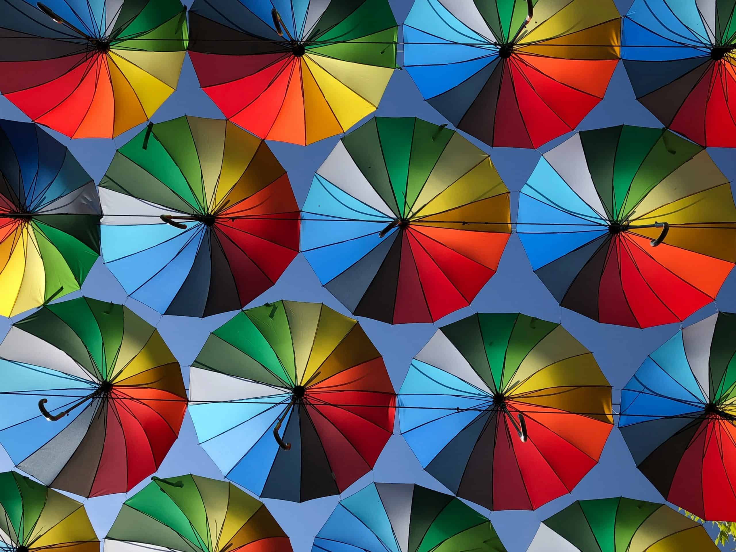
Extreme contrast, like stark black-and-white, may be tough on the eyes and cause discomfort—especially for visitors with dyslexia, sensory sensitivity, or on the autism spectrum. Instead, try harmonious similar shades (tones of blue, green, or tan) that provide subtle contrast without causing sensory overload.
3. Customization and Flexibility
The most inclusive brands offer users ways to tailor the color experience. If your site or product can allow users to switch to a low-contrast, pastel, or “calm mode” palette, it’s a win for accessibility—and for everyone. Options reduce frustration, show empathy, and build trust in your brand.
4. Empathy Before Rules
Testing your palette with real neurodiverse users (and being open to feedback) matters more than following any single design guideline or trend. Every individual’s sensory experience is unique, so continue learning, listening, and adjusting.
Practical Tips for Using Color Psychology for Neurodiverse Audiences
-
Use color sparingly for emphasis; don’t rely just on color to show important messages.
-
Combine soft accent colors with plenty of white or light neutral space for a sense of calm.
-
Stay consistent across all platforms, but do regular audits to catch colors or patterns that might be overwhelming.
-
Think “less is more” when introducing new colors or branding elements.
Wrapping Up on Color Psychology for Neurodiverse Audiences: Making Your Brand a Welcoming Place
The world isn’t made for just one kind of brain—so why should branding be? Designing with color psychology for neurodiverse audiences in mind signals that your brand is thoughtful, modern, and genuinely inclusive. The result: a brand that feels as welcoming and easy to engage with as it looks.
By making small changes to your brand palette, you can make a world of difference for every user—and set your brand apart as one that truly values diversity and inclusion.