Last week the design press finally got its hands on White & Case’s new identity, and the reaction was telling. A global law firm had dropped the navy, cut diagonals through its own name and started talking about energy. Professional services branding rarely makes headlines, which is exactly why this one did.
I have spent a good part of my career helping firms whose product is credibility: investors, advisers, researchers and consultancies. So this is a practical look at what the White & Case rebrand gets right, where the risk sits, and how a small senior agency approaches the same brief. If you run or market a firm like that, you will leave with a process and a few sharp questions to ask.
What did White & Case actually change?
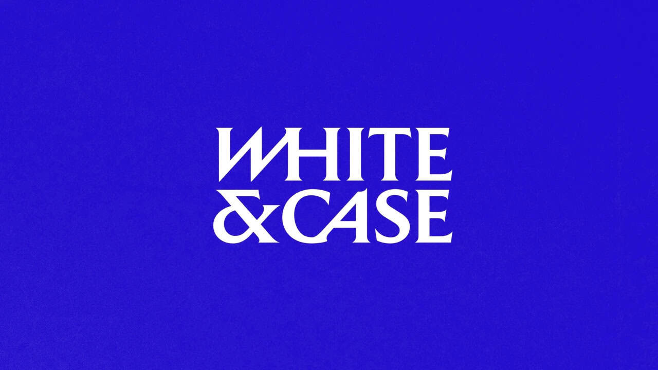
Creative Boom covered the rebrand on 27 October 2026. Uncommon Creative Studio replaced the firm’s navy with a bright shade it calls Catalyst Blue. It drew a custom serif with diagonal cuts that lean the letters forward, and it turned the ampersand into a standalone monogram. A proprietary tool stretches photography into streaks, so a skyline or a wind turbine reads as a line of data. The whole system is built around one idea: complexity is where the firm finds its edge.
It is the firm’s first major identity in 13 years, and the brief was plainly about escaping a crowded field. Lisa Smith, Uncommon’s global chief design officer, put it bluntly: “The legal sector is drowning in navy blue slabs.” Meanwhile, the comments under the legal trade coverage were, let’s say, mixed. That gap between the design world’s applause and the profession’s eye-rolling is the most useful thing about the story. It is the gap every firm has to cross.
Why does professional services branding all look the same?
Because sameness is rational. A law firm, a fund or a consultancy sells judgement, and judgement is hard to show. So firms borrow the visual codes of institutions that already have it: serifs, navy, marble, a skyline at dusk. The codes work, up to a point. They tell a buyer you are safe. Unfortunately, they also tell the buyer that every competitor is equally safe, and the decision then comes down to fees and the partner’s personal network.
There is a second reason, and it is cultural rather than visual. Partnerships decide by consensus, and consensus sands the edges off anything brave. The identity that survives forty partners is rarely the one that would have won the pitch. In my experience that is the real constraint on professional services branding, and no amount of clever typography fixes it without a process for handling it.

In a category built on sameness, one considered move is enough to be noticed.
What does Interbrand’s 2026 ranking add?
Interbrand published its Best Global Brands 2026 ranking on 28 October. Its central argument is that being famous and trusted no longer grows a brand on its own. The brands pulling ahead are the ones turning strength into action: creating new demand, deepening relationships and finding new routes to growth. Interbrand also notes that technology companies are earning revenue faster than they build emotional connection, and it warns them to keep investing in the brand.
Firms have the reverse problem. Decades of relationships, and a brand that says nothing about them. That is the thing about professional services branding: trust is the entry ticket, not the differentiator. Every serious firm has it, or claims to. What separates them is whether the brand does any work. Does it help a client choose, a graduate apply, or a partner open a conversation that was not already warm? If not, strength is sitting idle.
How we approach professional services branding at SOHO
A small senior agency cannot outspend Uncommon, and should not try. What we can do is run a tighter process. Here is the shape of ours, which sits inside our brand strategy work.
1. Start with the buying moment, not the logo
We interview the people who actually choose the firm: general counsel, limited partners, CFOs, procurement leads. We ask what they were afraid of when they hired, and what nearly stopped them. Those answers become the brief. The idea of complexity as opportunity is strong precisely because it answers a client fear rather than describing the firm.
2. Find the one true thing
Every firm claims excellence, global reach and a client-first approach. None of that is positioning. Instead, we look for the thing the firm does that competitors would find uncomfortable to copy, and we build the identity around it. Our work for EQT and Simudyne sits in this territory, where the audience is institutional and allergic to flourish.
3. Design the system before the symbol
Partners fixate on the logo because it is the only part they can see. Clients, however, mostly meet the firm through a proposal, a website, a LinkedIn post and an email signature. We design those first, as a system, and let the mark fall out of it. The White & Case ampersand works because it was built for lapel pins and sculptures alike. That is the discipline behind good visual identity: the symbol serves the system, not the other way round.
4. Rehearse the backlash
Before launch we show the identity to the sceptics inside the firm and write down every objection. Then we decide which ones are right. Some are. The rest get a prepared answer, because the first week after a rebrand is when partners wobble, and a wobble at the top travels fast.
Mistakes to avoid when rebranding a firm
- Mistaking a palette change for a strategy. Swapping navy for electric blue is a decision, not a reason. If the only story is “we wanted to look modern”, the identity will age in three years.
- Letting the partnership vote on aesthetics. Give partners the strategy to approve and the designers the craft to own. Ask forty people to pick a serif and you will get a compromise nobody loves.
- Ignoring the inside of the firm. Recruitment is where professional services branding earns its keep, and associates notice when the website promises energy and the office feels like 2009.
- Launching without the long tail. Proposals, templates, legal footers, event stands. Budget for the boring applications, or the brand will exist only on the homepage.
We wrote more about managing that transition without losing your audience in our guide to working with a rebranding agency.
Should your firm be this bold?
Probably not this bold, and that is fine. In professional services branding, boldness is relative to the category. In a field drowning in navy, a confident mid-blue and a typeface with a point of view is already a radical act. The question I would ask is simpler. If you removed the name from your website, could a client tell it was you? If the answer is no, your brand is doing no work, and Interbrand’s point about strength without action applies to you.
Three more questions are worth an hour with your leadership team:
- What do clients say about us when we are not in the room, and does our identity say the same thing?
- Which competitor would we be upset to be mistaken for?
- What would we never do visually, and why?
Answer those honestly and you will know whether you need a refresh, a repositioning or simply the nerve to use the brand you already have.
Talk to us about your firm’s Professional Services Branding
If any of this sounds like your firm, we would be glad to compare notes. Our brand strategy practice is built around exactly these conversations, and they tend to start small. Get in touch and tell us what is making you hesitate.