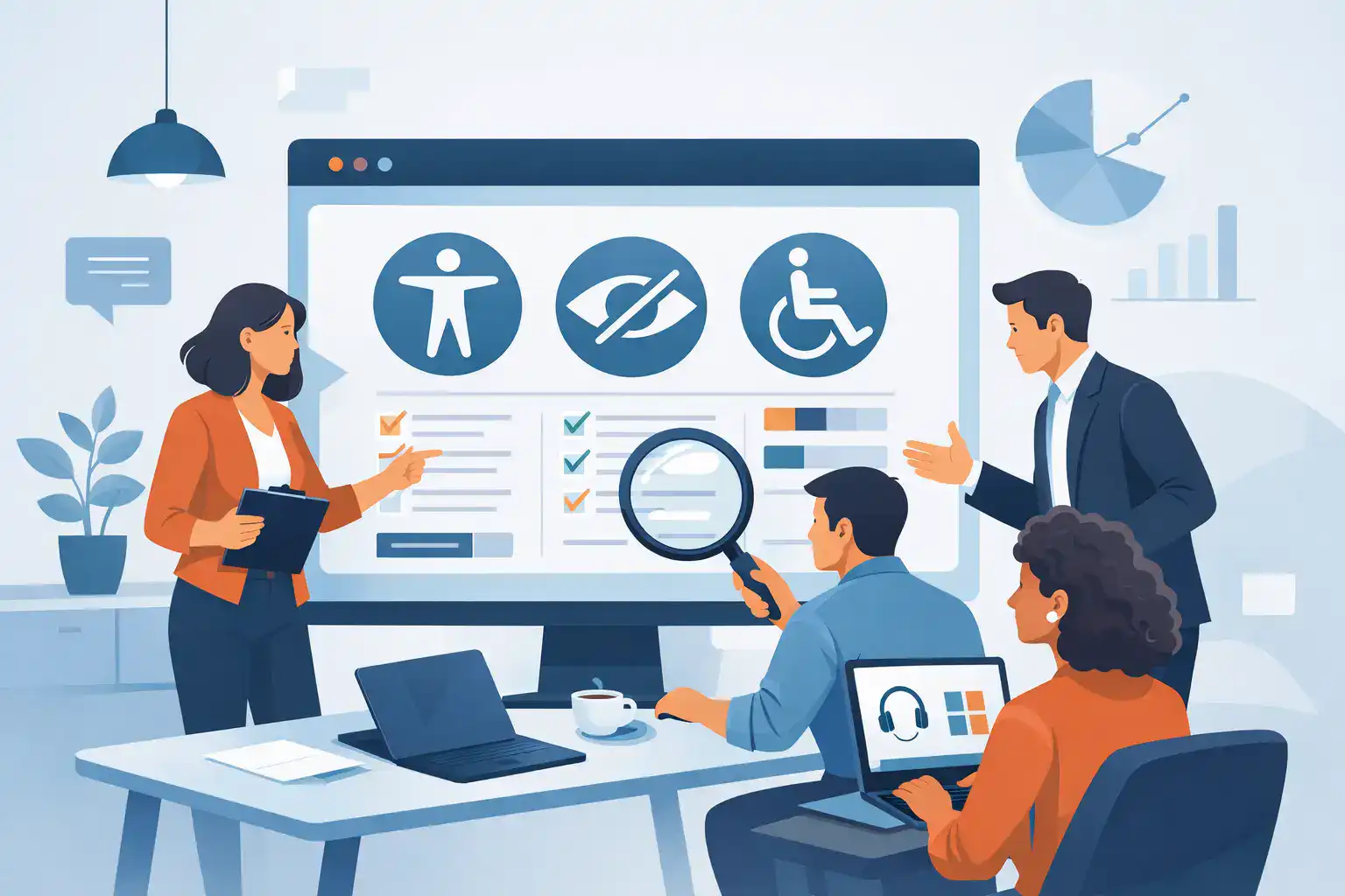
A prospect is ready to request a demo, book a consultation, or complete a purchase. Then a form label is missing, a keyboard user cannot reach the submit button, or essential information is communicated only through color. That is not a minor technical defect. It is a preventable break in the customer journey. A website accessibility audit identifies those breaks and gives leadership a practical basis for fixing the issues that affect users, compliance exposure, brand trust, and conversion performance.
For growth-minded businesses, accessibility should not sit outside the digital strategy. It belongs alongside messaging, UX, page speed, search visibility, and conversion rate optimization. A site that excludes part of its audience is leaving commercial value on the table, often at the exact moments where intent is highest.
What a website accessibility audit actually examines
A meaningful audit assesses whether people with different access needs can perceive, understand, navigate, and operate a website. That includes people using screen readers, keyboard-only navigation, voice controls, magnification tools, captions, or alternative input devices. It also benefits users in less permanent situations: someone reading in bright sunlight, watching a video without sound, recovering from an injury, or using a small mobile screen on an unreliable connection.
Most audits use the Web Content Accessibility Guidelines, commonly known as WCAG, as the technical benchmark. WCAG is not a design style guide, and passing a set of automated checks does not guarantee a usable experience. It provides a structured standard for evaluating content, interaction, code, and interface behavior.
The strongest audit combines automated scanning with expert manual testing. Automated tools are useful for finding repeatable code-level problems at scale, such as missing alternative text, empty form labels, duplicate IDs, or low color contrast. But they cannot reliably determine whether a page hierarchy makes sense, whether a call to action is understandable out of context, or whether a complex navigation flow works with a keyboard.
Manual evaluation closes that gap. It tests real user paths and exposes the issues that affect business outcomes: a product configurator that traps keyboard focus, a modal that cannot be dismissed, an error message that is not announced to assistive technology, or a checkout that gives users no clear way to correct a mistake.
Why accessibility is a performance issue, not just a compliance task
Compliance matters. Depending on your market, sector, and audience, inaccessible experiences can create legal and procurement risk. But treating accessibility as a last-minute legal exercise produces shallow work: a rushed scan, a document full of errors, and a patch cycle that fails to improve the experience.
The more commercial case is straightforward. Accessibility improves the quality of the digital product for more people. Clear labels make forms easier to complete. Logical heading structures make long pages easier to scan. Visible focus states help keyboard users and reduce confusion for everyone. Captions improve video comprehension and make campaign content usable in sound-off environments.
These improvements can support stronger engagement, clearer paths to conversion, and lower friction across the site. They can also protect the brand. For a professional-services firm, technology company, or investment-backed business, a digital experience that feels careless or difficult to use undermines the credibility of every positioning claim made on the page.
There is a trade-off to manage. Not every issue carries the same business impact, and teams rarely have unlimited capacity. An audit should therefore distinguish between critical blockers, high-priority journey friction, and lower-risk refinements. That enables practical decisions rather than an unmanageable remediation backlog.
Where accessibility issues most often affect revenue
The homepage is not always the highest-risk page. Organizations frequently invest heavily in its visual quality while overlooking the workflows that generate qualified leads or revenue. An effective assessment follows the customer journey rather than reviewing pages in isolation.
Lead generation and contact forms
Forms are a common failure point. Inputs may lack associated labels, validation errors may appear only in color, required fields may not be clearly communicated, or the focus may not move to the problem after submission. If a user cannot understand what went wrong, the lead is lost before sales ever sees it.
E-commerce product and checkout flows
Product filters, image galleries, size selectors, promotional drawers, and checkout fields create dense interaction patterns. These components need to work predictably with a keyboard and assistive technology. A visually polished commerce experience can still fail commercially if key controls are unavailable to a portion of buyers.
Navigation, search, and account areas
Mega menus, sticky headers, search overlays, and authenticated portals often introduce focus-order problems. A user should be able to understand where they are, move through controls in a logical sequence, and exit interactive elements without becoming trapped. These details matter even more on content-heavy sites with multiple service lines, regional pages, or resource libraries.
Video, PDFs, and campaign content
Accessibility is not limited to HTML pages. Videos may need accurate captions, while downloadable documents need readable structure, selectable text, appropriate headings, and meaningful descriptions. Campaign teams should also review how color, motion, language, and imagery communicate essential messages across paid and organic channels.
How to run a website accessibility audit that leads to action
Start by defining the scope around the parts of the site that matter most. For a focused engagement, that may mean priority templates and conversion paths: homepage, service pages, key landing pages, contact forms, product detail pages, cart, checkout, and account access. For larger platforms, the assessment should include representative templates, reusable components, and content types rather than attempting to inspect every URL manually.
Next, establish the standard and target level. Many organizations work toward WCAG 2.2 AA, but the right target can depend on legal obligations, contractual commitments, customer expectations, and the maturity of the existing platform. The key is to document the benchmark clearly before testing begins.
Then evaluate the site through multiple methods. Automated scans provide useful coverage. Manual keyboard testing reveals interaction defects. Screen reader testing validates structure, labels, announcements, and control behavior. Visual inspection catches contrast, text resizing, responsive behavior, and motion concerns. Reviewing the source code and component library helps uncover systemic issues that will otherwise reappear after individual pages are fixed.
The output should be a decision document, not a raw list of warnings. Each finding needs a clear description, affected URLs or components, the relevant criterion, severity, user impact, and recommended fix. It should also identify ownership. Some issues belong with developers, others with designers, content authors, marketing teams, or third-party platform providers.
A useful priority model weighs three factors: the severity of the barrier, how often it appears, and whether it interrupts a high-value journey. A missing label in a global form component deserves faster attention than a minor issue on an archived blog post. Equally, a defect affecting every navigation menu may be more urgent than a more dramatic but isolated flaw.
Remediation should improve the system, not just the page
The fastest route to lasting progress is to fix recurring issues at their source. If a button component lacks an accessible name, update the component. If contrast fails because brand colors are applied without defined accessible pairings, create a usable color system. If content teams publish heading levels inconsistently, provide templates and guardrails inside the CMS.
This is where accessibility becomes a design and operating-system question. Strong teams build requirements into briefs, wireframes, design reviews, development acceptance criteria, QA, and publishing workflows. They do not wait until a site is complete to find out whether fundamental interactions work.
Third-party tools require particular scrutiny. Scheduling widgets, chat modules, cookie banners, payment tools, embedded maps, and marketing forms can introduce barriers outside your core codebase. You may not control every fix, but you can assess vendors before procurement, request accessibility documentation, choose less risky alternatives, and avoid embedding tools that compromise essential journeys.
Retesting is non-negotiable. A remediation item is not complete because a ticket has been closed. Verify the fix in the live environment, including responsive states and the actual browsers and assistive technologies your audience is likely to use. Regression testing is equally valuable after platform releases, design updates, and new campaign launches.
Turn the audit into ongoing digital discipline
An audit is a snapshot. Websites change through new content, integrations, experiments, releases, and brand updates. Without ownership and process, the same problems return quietly.
Assign a clear internal owner, even when an external agency supports the work. Build accessibility checks into design sign-off and release QA. Train content contributors on headings, link text, alternative text, and accessible documents. Track critical issues against the same delivery cadence used for security, analytics, and performance work.
For leadership teams, the goal is not to pursue a theoretical perfect score. It is to build a website that more people can use with confidence, while reducing avoidable risk and protecting the conversion paths that fund growth. A well-run website accessibility audit gives you the evidence, priorities, and operating model to make that work measurable - and keep it moving.